
Brand: ECO BY SONYA Australia
Industry: Natural & Organic Skincare
Platform: Shopify
Website: https://ecotan.com.au/
Project Type: Conversion Rate Optimization (CRO) Audit
Audit Date: 21 July 2026
Table of Contents
Project Background
ECO BY SONYA is a well-established Australian skincare brand known for its certified organic products. While the brand has built strong trust in the market, the website still has several opportunities to improve the shopping experience and increase conversions.
The goal of this audit was to review the customer journey, identify friction points, and recommend practical improvements that could help more visitors become customers.
Since I did not have access to internal analytics, this was conducted as a qualitative CRO audit based on user experience, ecommerce best practices, and conversion principles.
Audit Process
I reviewed the website from the perspective of a first-time customer and analyzed the key stages of the buying journey:
- Homepage
- Collection Pages
- Product Pages
- Cart Experience
- Mobile Experience
The review focused on areas that commonly impact ecommerce conversion rates, including:
- Clarity of value proposition
- User experience
- Purchase friction
- Trust signals
- Product presentation
- Navigation
- Mobile usability
- Conversion opportunities
Key Findings
1. Homepage
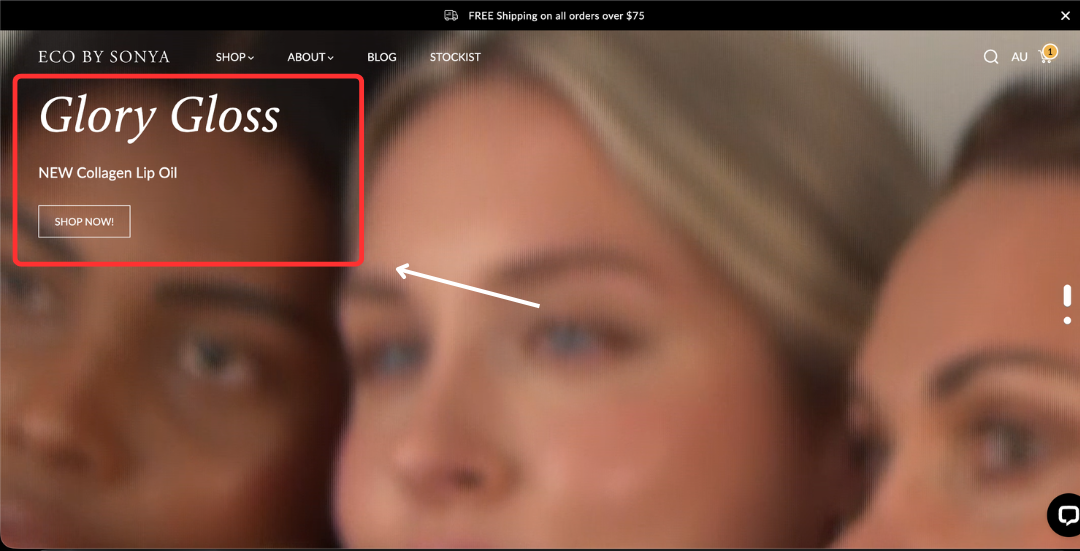
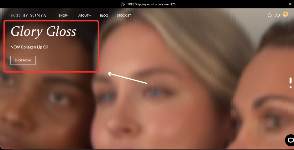
The homepage introduces the brand but misses several opportunities to quickly communicate why a visitor should choose ECO BY SONYA.
Main observations
- The hero section does not immediately communicate the brand’s strongest value proposition.
- The headline could better explain what makes the products different.
- The primary CTA lacks urgency and direction.
- Images load slowly, which can affect both user experience and conversion.
- Navigation could be simplified for faster product discovery.
- Product benefits are not explained clearly enough.
- Limited lifestyle imagery makes it harder for visitors to imagine using the products.
- User-generated content and customer photos are minimal.
- Shipping and money-back guarantees are not prominently displayed.
- The homepage lacks a dedicated brand story section that builds emotional trust.
- The email signup section feels generic and could provide a stronger reason to subscribe.
Mobile observations
The collection section displays only one product per row, requiring excessive scrolling. A two-column layout or swipeable carousel would make browsing much faster on mobile devices.
2. Collection Pages
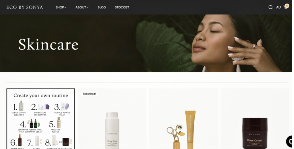
Collection pages should help shoppers quickly compare products and narrow down their choices. The current experience creates unnecessary friction.
Opportunities
- Add filtering options for skin concerns, product type, ingredients, and price.
- Improve sorting options.
- Expand product titles so shoppers immediately understand each product.
- Display customer ratings directly on product cards.
- Add an “Add to Cart” or “Quick Add” button.
- Highlight badges such as:
- Best Seller
- New
- Award Winner
- Limited Edition
- Improve pagination or consider a smoother loading experience.
3. Product Pages
The product page is where buying decisions happen, making it the highest-impact area for optimization.
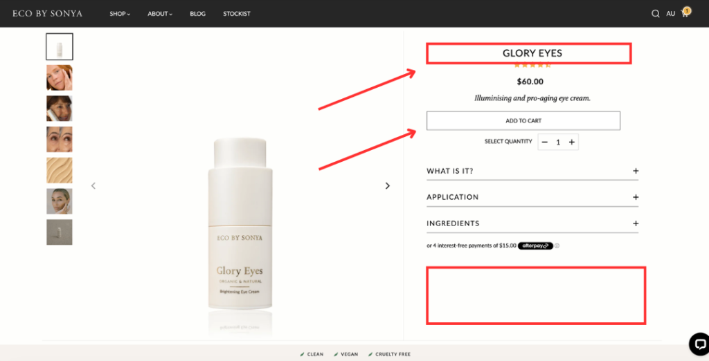
Main findings
- Product titles could be more descriptive.
- Product images take up too much screen space on desktop, pushing important information below the fold.
- Reviews are displayed only as star ratings, making social proof less persuasive.
- Shipping, returns, and refund policies are not immediately visible.
- Product benefits are not summarized into easy-to-scan bullet points.
- No cross-sell or upsell recommendations are presented.
- No sticky Add to Cart button on mobile.
- No express checkout options are highlighted for faster purchases.
These improvements would reduce purchase friction and make decision-making easier for shoppers.
4. Cart Experience
The cart experience is functional but offers limited opportunities to encourage checkout completion.
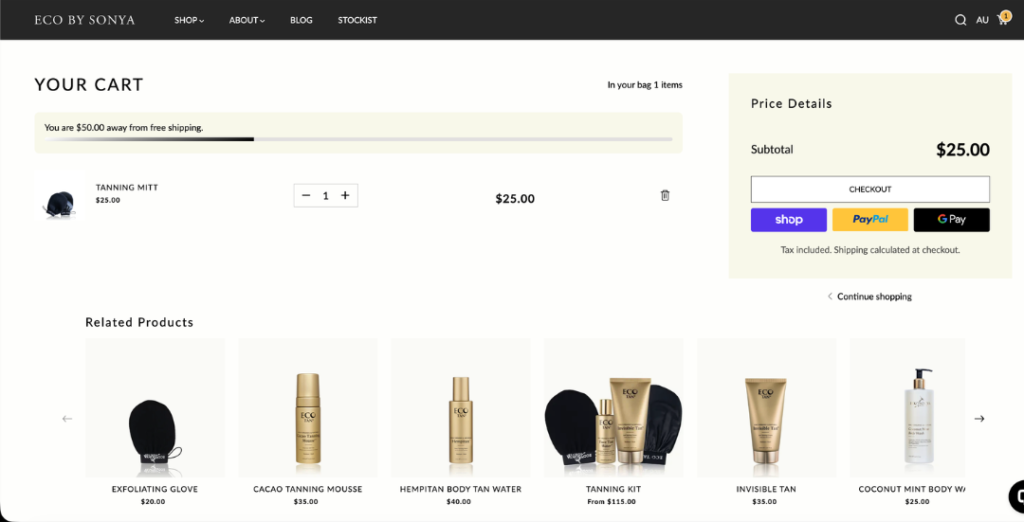
Potential improvements include:
- Display trust badges.
- Reinforce free shipping thresholds.
- Highlight money-back guarantees.
- Suggest complementary products.
- Show estimated delivery times.
- Add reassurance around returns and secure payments.
Priority Recommendations
High Priority
These changes would likely have the biggest impact on conversions.
- Improve the homepage hero section with a stronger value proposition.
- Add clearer product benefits throughout the site.
- Increase visibility of customer reviews and testimonials.
- Display shipping and refund information near purchase decisions.
- Improve product page structure for easier scanning.
- Add sticky Add to Cart functionality on mobile.
- Introduce express checkout options.
- Improve mobile browsing experience.
Medium Priority
- Improve navigation structure.
- Enhance collection pages with filters and sorting.
- Add product badges.
- Increase lifestyle photography.
- Include more user-generated content.
- Improve email capture strategy.
Lower Priority
- Add product recommendation sections.
- Expand brand storytelling.
- Improve product discovery with featured collections and product carousels.
- Refine pagination and browsing experience.
Expected Impact
Without access to analytics, it isn’t possible to estimate exact conversion improvements.
However, the recommendations focus on proven CRO principles that typically improve ecommerce performance by:
- Reducing purchase friction
- Increasing customer trust
- Improving product discovery
- Making buying decisions easier
- Creating a smoother mobile shopping experience
The greatest opportunities appear to be on the homepage and product pages, where visitors make their first impressions and final purchasing decisions.
Limitations
This audit was completed without access to internal performance data.
A full CRO engagement would normally include analysis of:
- Google Analytics
- Shopify Analytics
- Heatmaps
- Session recordings
- Scroll-depth analysis
- Conversion funnel data
- Customer behavior reports
- Device-specific performance
- A/B testing opportunities
These insights would allow recommendations to be prioritized based on real customer behavior rather than qualitative observation alone.
Conclusion
ECO BY SONYA has a strong brand and high-quality products, but several parts of the shopping experience can be refined to better support conversions.
Many of the opportunities identified are related to improving clarity, reducing friction, strengthening trust, and helping shoppers make confident purchasing decisions. Addressing these areas would create a smoother customer journey and provide a stronger foundation for future optimization efforts.
This audit serves as a starting point for identifying conversion opportunities. The next step would be validating these findings with customer behavior data and testing improvements through an ongoing CRO process.