

Brand: BIODANCE
Industry: Skincare & Beauty
Platform: Shopify
Website: https://biodance.com/
Monthly Traffic: Approximately 407,000 visitors
Project Type: Conversion Rate Optimization (CRO) Opportunity Audit
Audit Date: 22 July 2026
Table of Contents
Project Background
BIODANCE is a fast-growing skincare brand with a strong online presence and an estimated 407,000 monthly visitors. With this level of traffic, even small improvements to the customer journey can have a meaningful impact on conversions.
The goal of this audit was to review the website from a customer’s perspective, identify friction throughout the buying journey, and recommend practical improvements based on ecommerce and CRO best practices.
Since I did not have access to analytics or customer behavior data, this audit focused on qualitative observations rather than performance metrics.
Audit Process
I reviewed the website across the main stages of the customer journey:
- Homepage
- Collection Pages
- Product Pages
- Cart Experience
- Mobile Experience
The audit focused on areas that commonly influence ecommerce conversion rates, including:
- Value proposition
- User experience
- Purchase friction
- Trust signals
- Product presentation
- Product discovery
- Mobile usability
Key Findings
1. Homepage
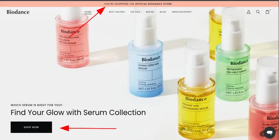
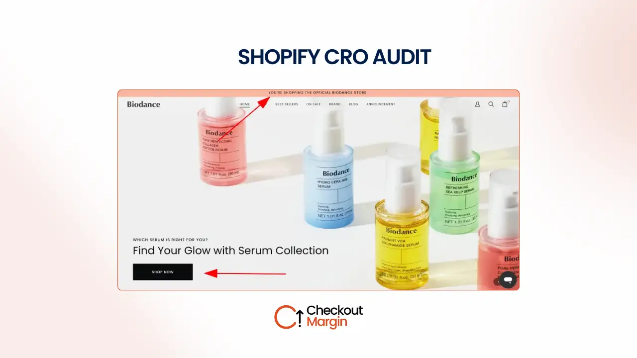
The homepage has a clean design and creates a premium first impression. However, there are several opportunities to communicate the brand’s value more clearly and build trust with new visitors.
Main observations
- The announcement bar does not highlight key purchase incentives such as free shipping, discounts, returns, or guarantees.
- Several section headlines describe products instead of explaining the benefits customers receive.
- A “Shop by Category” section below the hero would make browsing easier.
- The homepage does not include the brand story, making it harder to build an emotional connection with first-time visitors.
- There is no FAQ section to answer common customer questions.
- The newsletter signup lacks a compelling reason for visitors to subscribe.
- Customer reviews and trust badges are not prominently displayed.
- Shipping information and money-back guarantees could be more visible.
- The footer could better organize support links and policy pages.
2. Collection Pages
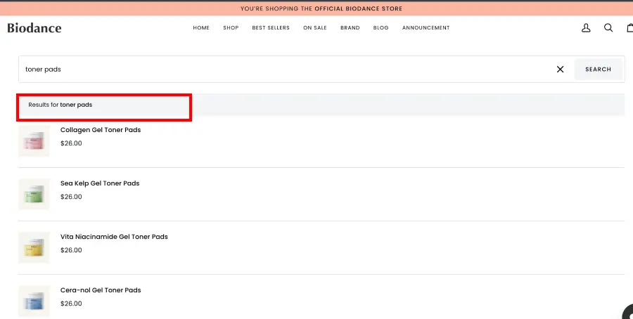
The collection page is simple and easy to navigate but could do more to help shoppers compare products.
Opportunities
- Make product images more prominent to improve visual browsing.
- Add labels such as Best Seller, New Arrival, or Award Winner.
- Include customer review counts on product cards.
- Consider adding quick add functionality to reduce clicks.
3. Product Pages
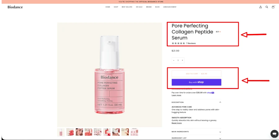
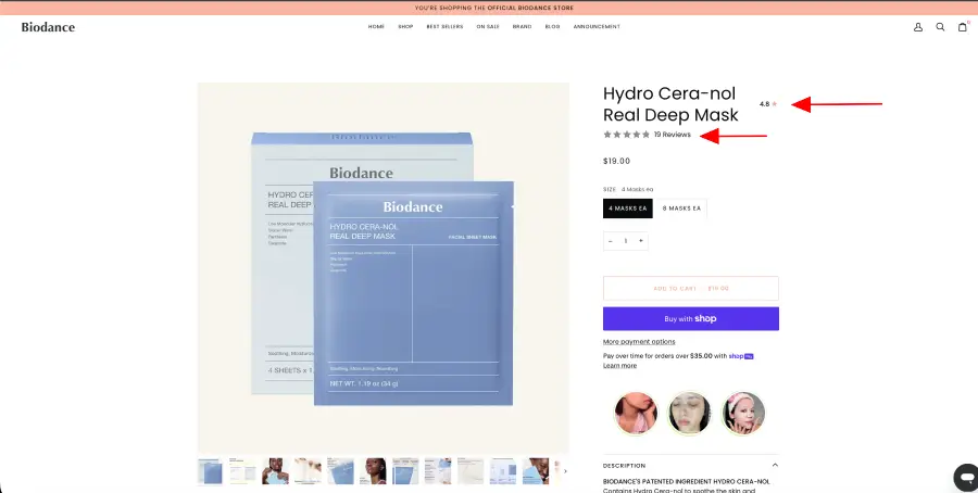
The product page contains detailed information, but several improvements could make purchasing feel easier and more reassuring.
Main findings
- The Add to Cart button does not stand out enough.
- Product images take up a large amount of space on desktop, pushing important information lower on the page.
- Product titles could better explain what the product does.
- Shipping, return, and exchange information should be visible above the fold.
- Product benefits appear too far down the page and should be moved closer to the purchase section.
- The quantity selector adds an unnecessary step for first-time buyers.
- Showing the total number of reviews would provide stronger social proof than displaying only a star rating.
- The FAQ section would be more useful lower on the page.
- Product recommendations could be placed closer to the main purchase area.
- A sticky Add to Cart button would improve the mobile shopping experience.
4. Cart Page
The cart experience is clean but misses opportunities to reinforce confidence before checkout.
Recommendations
- Add a free shipping progress bar or shipping reminder.
- Reinforce return policies and money-back guarantees.
- Display trust badges before checkout.
- Recommend complementary products without interrupting the checkout flow.
Priority Recommendations
High Priority
These changes are likely to have the greatest impact on conversions.
- Add a sticky Add to Cart button.
- Display shipping, returns, and exchange information above the fold.
- Increase the visibility of trust badges and money-back guarantees.
- Move product benefits closer to the purchase section.
- Display verified customer reviews on both the homepage and product pages.
- Improve the announcement bar with shipping, returns, or promotional messaging.
- Add a free shipping progress bar to the cart page.
Medium Priority
- Add a brand story to the homepage.
- Rewrite homepage headlines to focus on customer benefits.
- Introduce FAQ sections on the homepage and product pages.
- Add a Shop by Category section below the hero banner.
- Improve the newsletter signup with a stronger incentive.
- Make product images more prominent on collection pages.
Lower Priority
- Remove the quantity selector.
- Improve how reviews are displayed by emphasizing review count.
- Improve the search experience with filters and result counts.
- Update the footer with better navigation and support links.
Expected Impact
Without access to analytics, it’s not possible to predict exact conversion improvements.
However, these recommendations are based on proven CRO principles that aim to:
- Reduce purchase hesitation
- Improve customer trust
- Increase product discovery
- Make buying decisions easier
- Improve the mobile shopping experience
The biggest opportunities are on the homepage and product pages, where customers make their first impressions and purchasing decisions.
Limitations
This audit was completed using only the visible customer experience of the website.
A complete CRO engagement would also include:
- Google Analytics
- Shopify Analytics
- Heatmaps
- Session recordings
- Conversion funnel analysis
- Customer behavior data
- Device-specific performance
- A/B testing
These insights would help identify exactly where customers drop off and allow improvements to be prioritized using real data.
Conclusion
BIODANCE already has a strong brand presence and attracts significant monthly traffic. The biggest opportunity is improving how that existing traffic converts into customers.
Most of the recommendations focus on increasing trust, reducing friction, improving product presentation, and making important information easier to find during the buying journey.
This audit provides a practical roadmap for improving the customer experience. The next step would be validating these recommendations with customer behavior data and testing changes to measure their impact on conversion rate and revenue.