
Biodance was receiving around 407,000 monthly visitors, but several parts of the shopping experience were creating unnecessary friction between landing on the site and making a purchase.
We reviewed the store from a conversion perspective and identified opportunities across the homepage, collection pages, product pages and cart experience — without recommending a full redesign.
Industry: Skincare / Beauty
Platform: Shopify
Project: Conversion Optimisation / CRO Audit
Scope: Homepage / Collection / Product Page / Cart
The challenge
Biodance already had the traffic most ecommerce brands would want.
With approximately 407,000 monthly visitors, the bigger opportunity wasn’t simply getting more people to the site. It was making better use of the traffic already arriving.
The store had a solid visual foundation, but important purchase information was either difficult to find, positioned too late in the experience, or not given enough visual importance.
For a first-time customer, this meant they could still have unanswered questions around things like:
- Why should I choose this product?
- What makes the brand different?
- Can I trust the product?
- What happens if I don’t like it?
- How much does shipping cost?
- Can I return or exchange it?
- What are other customers saying?
The good news was that most of these issues could be addressed through better information hierarchy, stronger trust signals and small UX improvements, rather than rebuilding the entire store.
What we found
01 — The product page wasn’t doing enough to reduce purchase hesitation
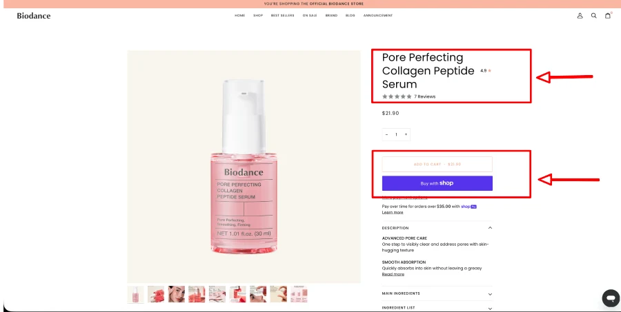
The product page contained the core information needed to purchase, but some of the most important reassurance elements weren’t visible early enough.
Shipping, returns and exchange information were not clearly visible above the fold, while product benefits appeared further down the page.
The add-to-cart button also lacked enough visual prominence.
For a customer who is already interested in the product, these details matter. The closer someone gets to purchasing, the more important it becomes to remove small sources of doubt.
02 — Trust signals weren’t positioned where customers needed them
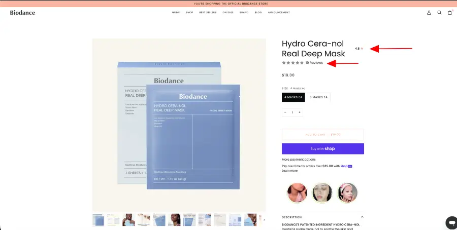
Biodance had opportunities to make the purchasing experience feel safer, but trust elements weren’t consistently prominent at the decision point.
We recommended making verified reviews, trust badges and a money-back guarantee much more visible, particularly around the product purchase area.
The review presentation could also be simplified. Instead of giving too much emphasis to the average star rating, the total number of reviews can provide stronger social proof.
For example, “4.8 ★ from 2,000+ customers” communicates both quality and volume more effectively than a rating displayed without enough context.
03 — Product benefits appeared too late
A skincare customer doesn’t only need to know what the product is.
They need to understand why it is worth buying.
The product benefits section was positioned too far down the page. This means customers have to scroll before getting a clear explanation of the value they’re going to receive.
Benefits should be introduced much earlier in the product experience, ideally close to the product information and CTA.
The goal isn’t to add more copy. It’s to make the right information available at the right moment.
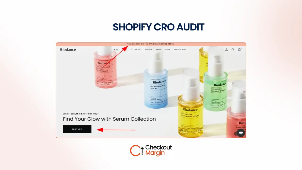
04 — The homepage had opportunities to communicate the brand faster
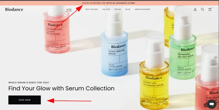
The homepage looked like a place where Biodance could do more to answer the basic questions a new visitor has within their first few seconds.
The announcement area didn’t clearly communicate key purchase incentives such as shipping, discounts or return policies.
There was also an opportunity to improve the messaging throughout the homepage. Several headlines could be rewritten to focus more directly on customer benefits rather than simply describing the section or product.
Other missing opportunities included:
- Shop-by-category navigation
- Brand story
- Stronger trust signals
- Verified reviews
- Money-back guarantee
- FAQ content
- Better newsletter incentive
These elements don’t all need to be added at once. The important point is that the homepage should help a new visitor understand what Biodance sells, why it matters, and why they should trust the brand.
05 — Navigation and shopping UX could be more useful
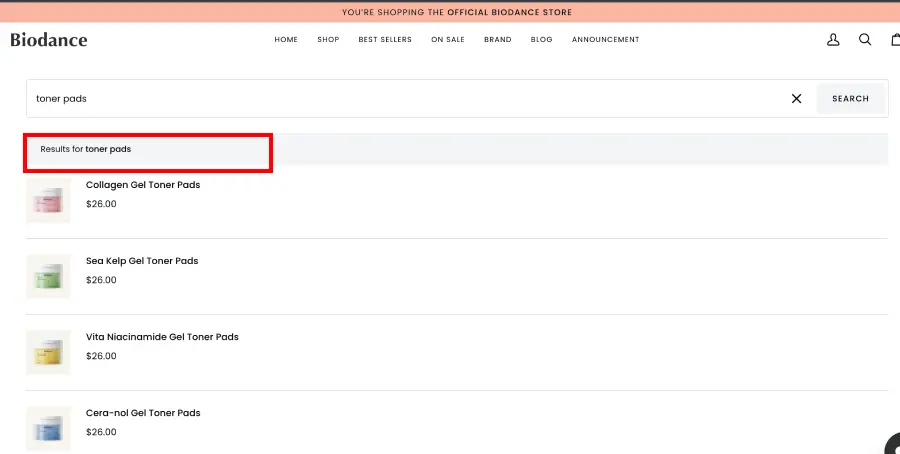
The collection and search experiences had smaller usability issues that could create unnecessary friction.
On the collection page, the product grid could benefit from a more image-dominant presentation, making the products easier to scan visually.
Search was another opportunity.
A customer searching for a specific product or category should be able to understand:
- How many results were found
- How to filter those results
- How to narrow down their options
Adding filtering and a visible result count would make the search experience more useful, particularly for a store with a growing catalogue.
What we’d change
The goal wasn’t to redesign Biodance.
The goal was to remove friction from the existing experience and make important information easier to understand at the right moment.
Product page
Current experience → Recommended experience
Current: Add-to-cart button doesn’t stand out enough
Recommended: Give the primary CTA stronger visual hierarchy so it is immediately identifiable.
Current: Shipping, returns and exchanges aren’t clearly visible above the fold
Recommended: Place concise policy reassurance close to the CTA.
Current: Product benefits appear further down the page
Recommended: Bring the strongest benefits closer to the product information and purchase decision.
Current: Trust signals aren’t prominent enough
Recommended: Add verified reviews, trust badges and money-back guarantee messaging near the decision point.
Current: Review display places emphasis on the star rating
Recommended: Make the review volume prominent alongside the rating.
Current: Product imagery takes up a large amount of space
Recommended: Rebalance the product media and information layout so customers can see the product while still accessing important purchase information quickly.
Current: Quantity selector adds an unnecessary decision
Recommended: Remove it and keep the primary purchase action focused.
Current: FAQ content appears too early relative to the purchase journey
Recommended: Move FAQ content lower on the page, after the customer has had an opportunity to understand the product and its benefits.
Current: Upsell opportunity appears too late
Recommended: Test moving relevant upsell products closer to the main purchase decision.
Current: No sticky add-to-cart experience
Recommended: Test a sticky mobile/desktop add-to-cart bar so the primary action remains accessible as customers scroll.
Homepage
The homepage should work harder as an introduction to the brand.
We’d recommend:
- Adding a useful announcement bar communicating shipping, discount or returns
- Rewriting key headlines around customer benefits
- Adding a shop-by-category section beneath the hero
- Introducing the brand story
- Adding verified customer reviews
- Introducing trust badges or relevant “Featured In” proof
- Making money-back and shipping reassurance easier to find
- Improving the newsletter signup with an actual incentive
- Adding a useful FAQ section
- Strengthening the footer with important policy and contact links
Collection page
The collection page doesn’t need a major structural change.
The main opportunity is improving how quickly customers can scan products.
We’d recommend a more image-dominant product grid where the product photography does more of the visual work.
The goal is to make browsing feel quicker and more intuitive, particularly on mobile.
Search
Search should help customers narrow their choices rather than simply return products.
We’d recommend:
- Adding filters
- Showing the number of results
- Making filtering easier on mobile
- Improving the visibility of the search state
Cart page
The cart is one of the final opportunities to reinforce the value of completing the order.
A simple improvement would be adding a free-shipping progress indicator beneath the selected products.
For example:
“You’re £18 away from free shipping.”
This gives customers a clear reason to continue shopping and makes the shipping threshold feel actionable rather than hidden somewhere else on the site.
What we’d prioritise?
Not every recommendation deserves to be worked on immediately.
We’d prioritise the changes based on their likely impact on the purchase decision and the effort required to implement them.
High impact / Low effort
Fix first.
- Make the add-to-cart CTA more prominent
- Add shipping, returns and exchange reassurance above the fold
- Add trust badges and money-back guarantee messaging
- Improve review presentation and show review volume
- Move key product benefits higher
- Add a useful announcement bar
- Add a free-shipping progress message to the cart
These changes directly address purchase hesitation without requiring a major rebuild.
High impact / Higher effort
Plan next.
- Redesign the product-page information hierarchy
- Implement sticky add-to-cart functionality
- Improve the homepage structure
- Add a stronger brand story section
- Build a better search and filtering experience
- Improve the collection product grid
These changes require more design and development work but can improve the overall shopping journey.
Low impact / Low effort
Do when convenient.
- Improve footer structure
- Add FAQ content
- Improve newsletter signup messaging
- Refine spacing across key sections
- Improve secondary homepage headlines
These are worthwhile improvements, but they shouldn’t take priority over changes closer to the purchase decision.
Low impact / High effort
Don’t bother yet.
A full website redesign would be unnecessary at this stage.
The store’s biggest opportunities are not dependent on rebuilding everything from scratch.
Before committing significant resources to a redesign, we’d first implement and measure the higher-impact CRO improvements.
What we’d measure
Because these recommendations were based on a CRO audit rather than an implemented client project, we aren’t presenting predicted improvements as results.
The next step would be to measure the actual effect of the changes.
We’d track:
- Conversion rate
- Add-to-cart rate
- Product-page conversion rate
- Checkout initiation rate
- Revenue per visitor
- Average order value
- Cart abandonment rate
- Product-page engagement
- Mobile vs desktop conversion rate
- Search usage and search-to-purchase behaviour
The most important part would be establishing a baseline before making the changes, then comparing performance after implementation.
The bigger opportunity
Biodance doesn’t appear to have a traffic problem.
With around 407,000 monthly visitors, the bigger opportunity is making the existing traffic work harder.
The audit identified several relatively straightforward improvements around trust, information hierarchy, product benefits, purchase reassurance and UX friction.
None of these require throwing away the existing Shopify store.
The opportunity is to systematically remove the reasons a customer might hesitate — and then use real behavioural and conversion data to determine which improvements actually move the numbers.
Audit methodology
This review was based on the visible customer experience of the Biodance Shopify store.
A complete CRO programme would go further by combining the qualitative audit with behavioural and performance data from sources such as:
- Google Analytics
- Shopify Analytics
- Heatmaps
- Session recordings
- Conversion funnel analysis
- Customer behaviour data
- Device-level conversion data
That additional data would allow us to identify where customers are actually dropping off, rather than relying solely on what is visible during a manual review.
This case study therefore focuses on opportunities identified during the audit, not claimed performance results.