

Brand: Pour Moi Skincare
Industry: Skincare & Beauty
Platform: Shopify
Website: https://pourmoiskincare.com/
Monthly Traffic: Approximately 7,100 visitors
Project Type: Conversion Rate Optimization (CRO) Opportunity Audit
Audit Date: 26 July 2026
Project Background
Pour Moi Skincare is a premium skincare brand offering climate-smart skincare products through its Shopify store. With approximately 7,100 monthly visitors, maximizing the value of existing traffic is essential. Every unnecessary obstacle in the buying journey can reduce the chances of converting visitors into customers.
The goal of this audit was to evaluate the customer experience, identify conversion barriers, and recommend practical improvements based on ecommerce and CRO best practices.
Since I did not have access to analytics or customer behavior data, this audit focused on qualitative observations rather than performance metrics.
Audit Process
I reviewed the website across the key stages of the customer journey:
- Homepage
- Collection Pages
- Product Pages
- Cart Experience
- Mobile Experience
The audit focused on the areas that most influence ecommerce conversions, including:
- Value proposition
- User experience
- Purchase friction
- Trust signals
- Product presentation
- Navigation
- Mobile usability
Key Findings
1. Homepage
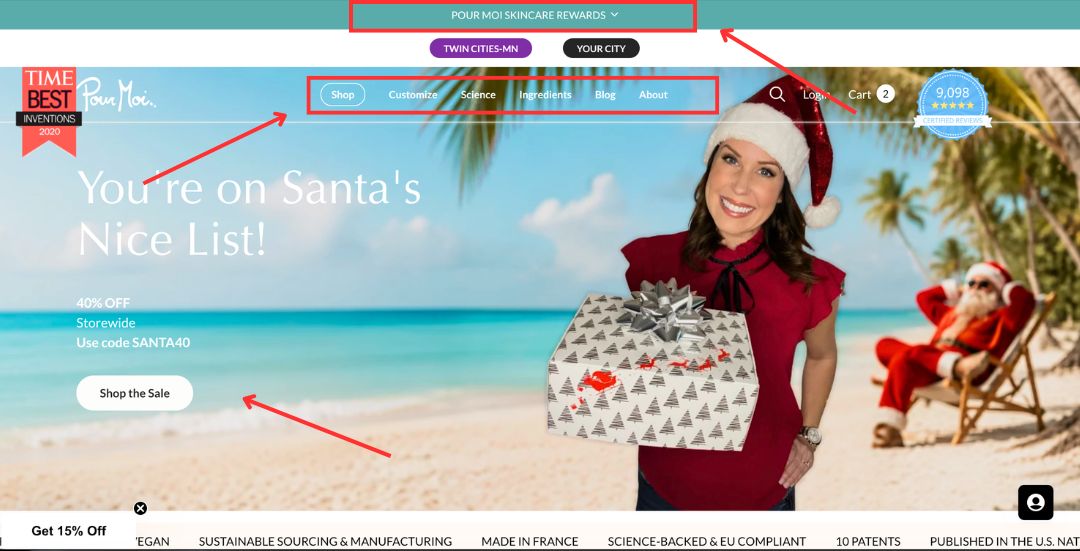
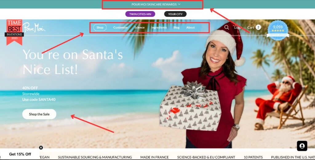
The homepage has a clean design, but it does not immediately explain what the brand offers or why visitors should keep exploring.
Main observations
- The announcement bar does not clearly communicate important customer benefits such as shipping, returns, or guarantees.
- The hero headline focuses more on branding than explaining what the products do.
- Best Sellers and Popular Collections are missing from the main navigation, making product discovery more difficult.
- Return, exchange, money-back guarantee, and shipping information are not easy to find.
- Some sections would benefit from improved spacing to create a cleaner reading experience.
- The search function lacks filters, making it harder for customers to find specific products.
2. Collection Pages
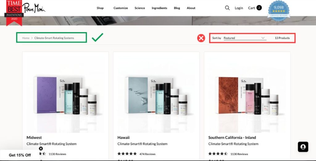
The collection pages are easy to browse but could better support product discovery.
Opportunities
- Add filtering options to help customers narrow products by category or concern.
- Reduce the height of the collection banner so products are visible immediately without excessive scrolling.
- Improve the first impression by placing more emphasis on the product grid.
3. Product Pages
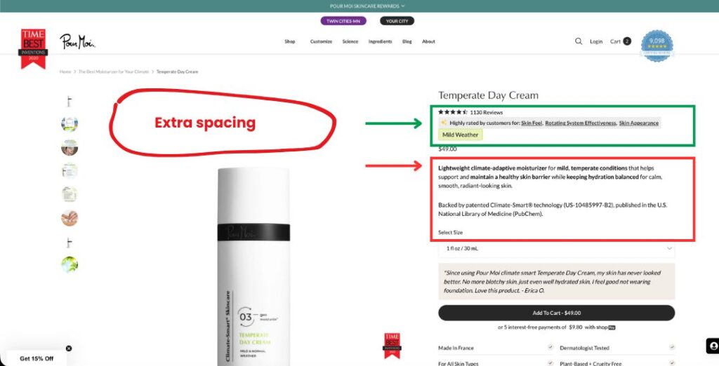
The product page presents useful information but introduces unnecessary friction during the purchase process.
Main findings
- Product images are oversized, pushing important purchase information below the fold.
- The Add to Cart button is not immediately visible, requiring users to scroll before taking action.
- Shipping, return, and money-back guarantee information should be displayed near the purchase section.
- Product descriptions could be shortened to make key information easier to scan.
- There are no cross-sell or upsell recommendations.
- Express checkout options such as Shop Pay, Apple Pay, or Google Pay are not available.
- A sticky Add to Cart button would improve the mobile shopping experience.
4. Cart Page
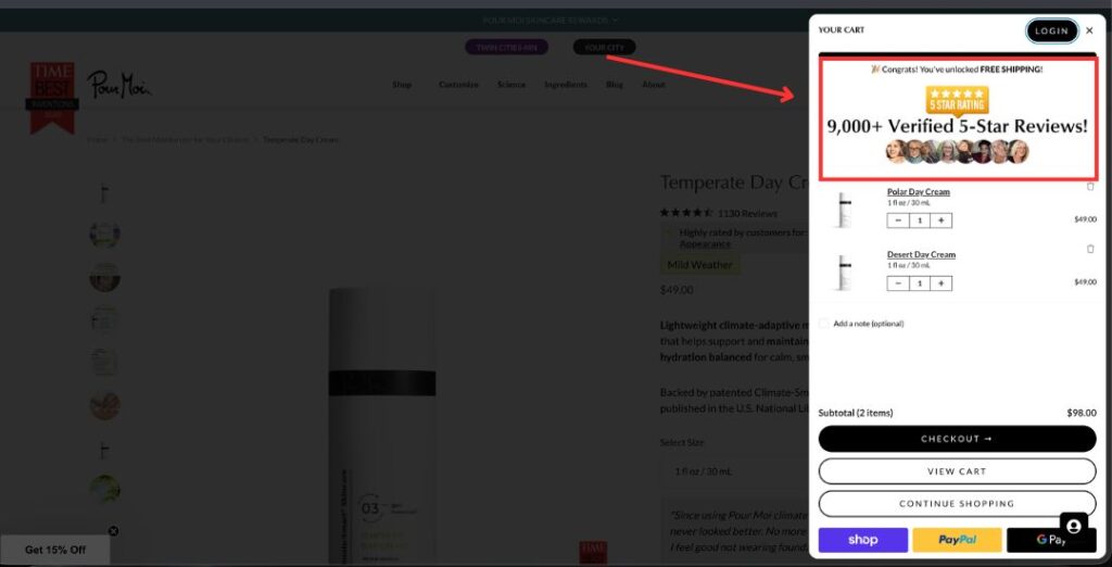
The cart experience works well overall but could provide more reassurance before checkout.
Recommendations
- Simplify the slide-out cart by reducing unnecessary visual elements, such as large review images.
- Add product recommendations to increase average order value.
- Include a shipping estimate or free shipping progress indicator.
- Consider a single-page checkout experience to reduce friction during the final purchase step.
5. Mobile Experience
Most ecommerce traffic now comes from mobile devices, making mobile usability critical for conversions.
Opportunities
- Ensure the Add to Cart button remains visible while users scroll.
- Improve spacing to make product information easier to read.
- Reduce oversized images so important information appears sooner.
- Simplify navigation and product browsing for smaller screens.
Priority Recommendations
High Priority
These improvements are likely to have the biggest impact on conversions.
- Rewrite the homepage hero section to clearly communicate what the brand sells.
- Make the Add to Cart button visible without scrolling.
- Add a sticky Add to Cart button.
- Display shipping, returns, and money-back guarantees above the fold.
- Add express checkout options.
- Reduce oversized product images.
- Improve the announcement bar with clear customer benefits.
Medium Priority
- Add filters to collection and search pages.
- Add cross-sell and upsell recommendations on product and cart pages.
- Reduce the height of the collection page banner.
- Improve homepage spacing and content hierarchy.
- Add Best Sellers and Popular Collections to the navigation.
Lower Priority
- Simplify the slide-out cart.
- Add a shipping estimate or free shipping progress bar.
- Improve the checkout flow with a single-page checkout experience where possible.
Expected Impact
Without access to website analytics, it is not possible to estimate exact conversion improvements.
However, these recommendations focus on proven CRO principles that typically help ecommerce stores by:
- Reducing purchase friction
- Improving customer confidence
- Increasing product discovery
- Making important information easier to find
- Creating a smoother mobile shopping experience
The greatest opportunities appear on the homepage and product pages, where visitors form their first impressions and make purchasing decisions.
Limitations
This audit was completed using only the visible customer experience of the website.
A complete CRO engagement would normally include:
- Google Analytics
- Shopify Analytics
- Heatmaps
- Session recordings
- Conversion funnel analysis
- Customer behavior data
- Device-specific performance
- A/B testing
These insights would help identify exactly where customers abandon the buying journey and prioritize improvements based on real customer behavior.
Conclusion
Pour Moi Skincare has a solid foundation, but several improvements could make the shopping experience clearer and more conversion-focused.
Most of the recommendations involve improving the visibility of key purchase information, reducing friction, strengthening customer trust, and making it easier for visitors to find and buy products.
This audit provides a roadmap for improving the customer journey. The next step would be validating these recommendations with customer behavior data and testing changes to measure their impact on conversion rate and revenue.